Please add a small arrow in the market profile that moves with the closing price
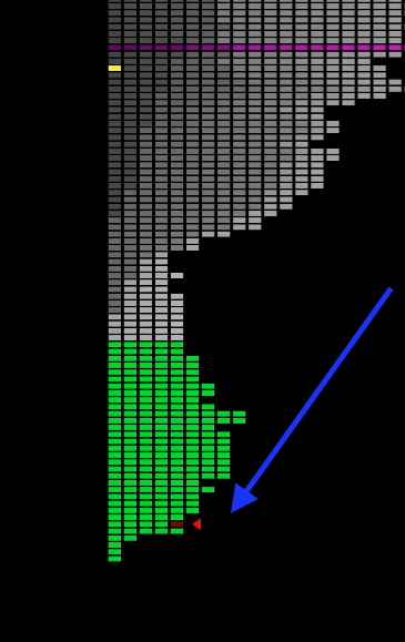
Unfortunately, it is not possible for me to recognize the closing price in a daily view with the market profile in order to make an analysis where the closing price plays a role. Could you please, as in Sierra Chart, add a small arrow to the market profile (in the screenshot the small red arrow) that runs with the closing price? That would be a great help. Greetings
Log in to comment and vote
Comments4
Veri
Feb 6, 2024
I agree adding a small arrow would be helpful and increase (quicker) visibility. I think it should be added to both the Open and the Close, as both the open and close use the same set color and that color might not work well with the rest of the profile colors. For example in Vanodga's screenshot you can easily tell where closing/current price is but you can't tell where the open was.
Mike
Feb 1, 2024
Vanodga
Feb 6, 2024
By default, the closing price is gray, but you can change the color to red, for example, to make it more visible:
Mike
Feb 6, 2024
Yes, I know that and have tried several colors. The problem is that the field is too small, so you would need an arrow to even recognize the closing price in such a daily profile. Or can you recognize the respective closing prices on my picture (above)? The closing price should be quickly recognizable at a glance.