Define TPO Blocks
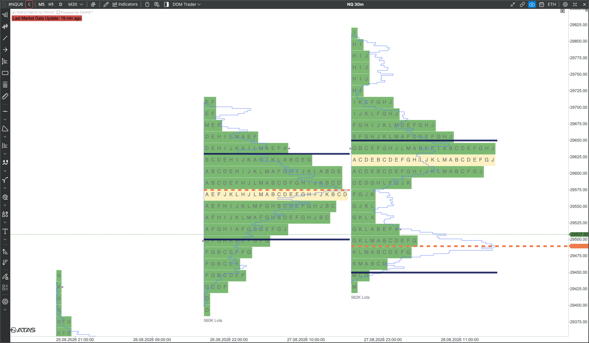
The TPO blocks can look quite cluttered. There isn't enough clear definition between individual blocks, and the white spacing between them isn't particularly well defined. As a result, the different TPO blocks tend to merge together, making the overall profile look more like a mesh of colours rather than clearly separated TPO periods.
I have recently been using Sierra Chart, and I think their TPO charts would be a very good reference point. Their profiles have much clearer separation and definition between the individual TPO blocks, which makes the structure of the profile much easier to read at a glance.
Log in to comment and vote
Comments3
Linked to implement a tick multiplier for its indicators
jeni
Sep 25
You can change the tick size of the blocks that will help