Add Bookmap-Style Bid / Last Trade / Ask Columns to the Heatmap
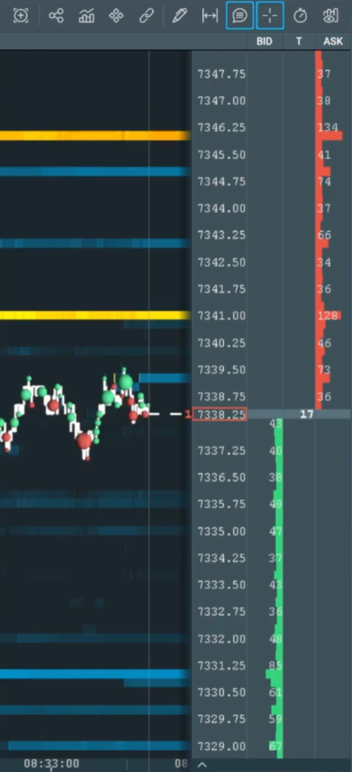
Hello, I’ve been loving the new heatmap and I do have a few suggestions. It’d be great to have an option to add Bookmap-style Bid, Last Trade, and Ask columns beside the price axis on the ATAS heatmap (see attached screenshot).
The biggest visible trade/liquidity in the current visible range should have:
the longest bar
the darkest/highest-intensity color
with all other values scaling proportionally relative to the visible maximum, just like Bookmap.
Would also be great if the text alignment matched Bookmap:
Bid column numbers aligned/skewed to the right
Center Last Trade column numbers centered
Ask column numbers aligned/skewed to the left
This layout makes the heatmap much easier to read quickly and helps visually separate bid/trade/ask activity at a glance.
Would also love:
aggregated or unaggregated last trade mode
customizable column widths/colors
I think this would massively improve ATAS heatmap readability and orderflow visualization.
Thank you so much!
Log in to comment and vote
Comments2
Stephan
Sep 23
•Merged request
•1 vote
Heatmap
I want to provide some feedback for the heatmap. I have been using ATAS for a while and Bookmap for many years. I like the heatmap in ATAS so far, here is some feedback that can hopefully be used to make the product even better: 1) system is using 5x CPU resources as bookmap (needs to be improved), 2) trades should be able to be placed in the heatmap window (same as bookmap)
Craig
Sep 23
•Merged request
•1 vote
Heatmap Last Price line
Hi ATAS dev team. Please could you add the option for the Last Price line (and colouring options) to the Heatmap. I’m coming over from Bookmap and this is something I miss.
Great Job you are doing thanks