Controllable width and color of Value Area high, Value Area low and POC
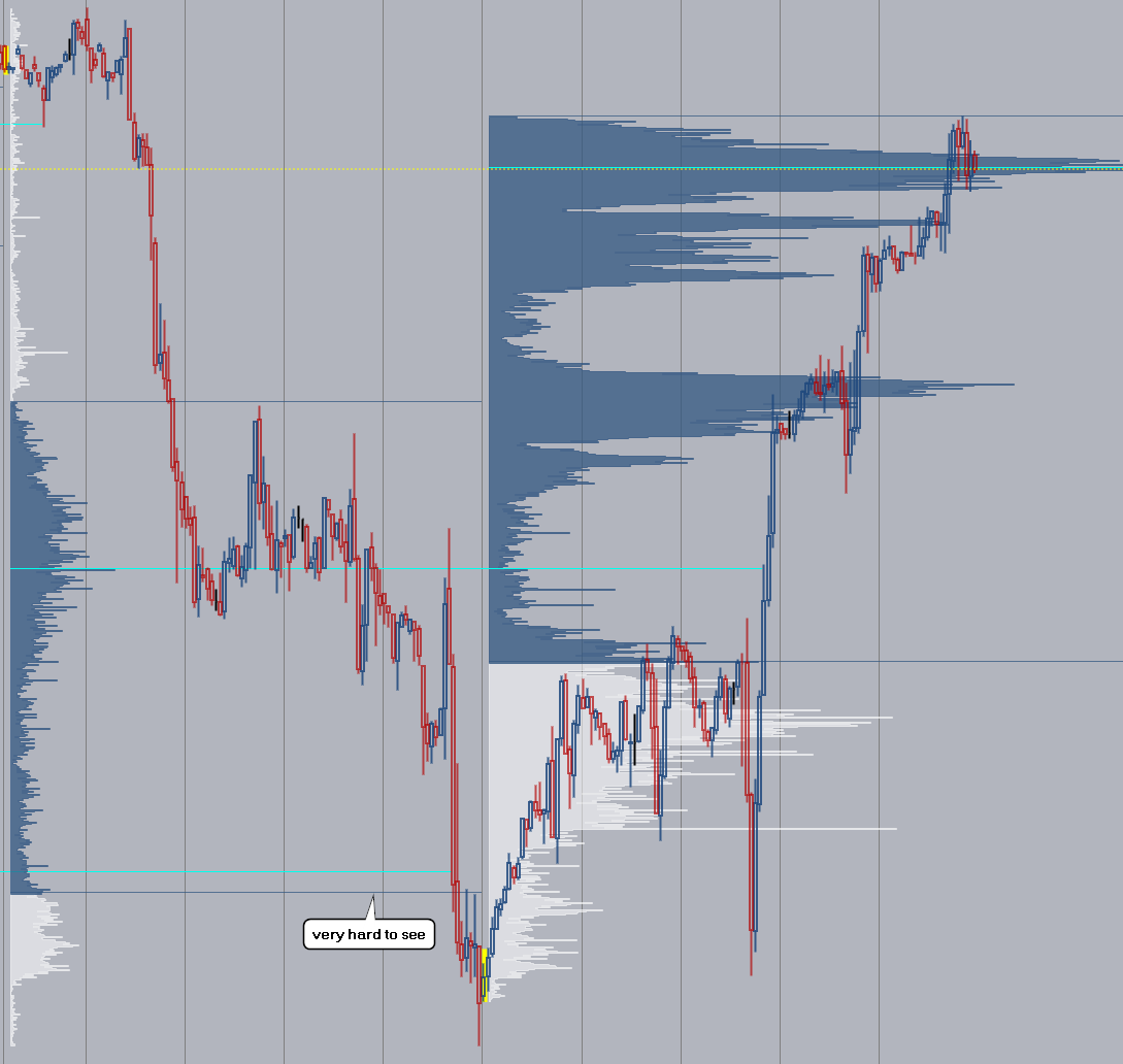
The value area high and low lines are very hard to read. Please make them controllable so you can increase the width and adjust the color separately to the value area color. A possibility would be to increase x amount of ticks above and below the VAH and VAL price so the lines get thicker, but the value shown on the price scale stays the original VAH and VAL price, same goes for POC. As it is now you have to zoom way in to see the lines and lose the bigger picture, which is not practicable. It is also very stressful for the eyes looking at the thin lines all day long.
Please authenticate to join the conversation.
In review
💡 Feature Request
Over 1 year ago

Soheil
Subscribe to post
Get notified by email when there are changes.
In review
💡 Feature Request
Over 1 year ago
Soheil
Subscribe to post
Get notified by email when there are changes.